Build and Shoot Badges
-
TheGeekZeke101

Deuced Up - Posts: 116
- Joined: Sun Dec 02, 2012 6:54 pm
I love MKU's badges. Although I will say, I'm going to be jealous of that orange Artist one.
-
HoboHob

Winter Celebration 2013
- Posts: 979
- Joined: Mon Nov 05, 2012 5:02 pm

-
MKU

Artist
- Posts: 383
- Joined: Wed Oct 31, 2012 12:20 am
danhezee wrote:Nice,
I would be interested in seeing them with a transparent background. If you get a chance


There you go, sir.

[12:40:09] <+StackOverflow> grab butt
-
danhezee

Former Admin / Co-founder
- Posts: 1710
- Joined: Wed Oct 03, 2012 12:09 am

-
TheGeekZeke101
Deuced Up - Posts: 116
- Joined: Sun Dec 02, 2012 6:54 pm
Can you give an example of both sets of badges as if they were under someone's avatar? It's hard to choose one that looks "better" without seeing it in action.
-
topo

Global Moderator
- Posts: 179
- Joined: Thu Nov 01, 2012 12:43 pm
Transparent backgrounds plsplspls
HLAGHLUAHGLUAHG
-
SIMOX

Deuced Up - Posts: 96
- Joined: Sat Nov 17, 2012 3:11 pm
danhezee wrote:I must say i don't like the font used and what about modder having gray color instead of purple. You know as SLAB6's background is originaly gray.

-
MKU
Artist - Posts: 383
- Joined: Wed Oct 31, 2012 12:20 am
SIMOX wrote:Hmm... gray... good idea. :Pdanhezee wrote:I must say i don't like the font used and what about modder having gray color instead of purple. You know as SLAB6's background is originaly gray.
And the font is experimental. It's always a pain in the ass to find a decent font. But then again, it's not always about the font, it's how you present the font.
[12:40:09] <+StackOverflow> grab butt
-
Mr.Torch

Artist - Posts: 988
- Joined: Sat Dec 15, 2012 2:46 am
I agree with simox I would definitely get a different font... maybe Comic Sans? XD jk but yeah different font.
Also imho if i had to choose between those I would definitely go with the transparent. I think the background has too much going on and takes away from it and the way you "present" the font, it is very hard to read and the shine is too drastic (i suggest to thin out the shine) unless you add a darker dropshadow... probably about just a 2-4 px drop shadow on top of the current drop shadow, that would be nice.
@danhanzee - Could you add a poll with all the currently submitted designs for people to vote on?
-
danhezee
Former Admin / Co-founder - Posts: 1710
- Joined: Wed Oct 03, 2012 12:09 am
-
Tank
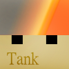
Artist - Posts: 61
- Joined: Tue Oct 23, 2012 3:12 pm
Just experimenting some more, no idea what people like.


-
TheGeekZeke101
Deuced Up - Posts: 116
- Joined: Sun Dec 02, 2012 6:54 pm
Tank wrote:Just experimenting some more, no idea what people like.I like yours, but I think MKU's are a bit more "playfull" in a sense. Personally I like your second example.
I'd like to see one with a head and the title below it. I think that'd look neat, even though it would take up some space.
-
Handles

League Participant
- Posts: 1087
- Joined: Tue Jan 08, 2013 9:46 pm
i like the head in them!


-
danhezee
Former Admin / Co-founder - Posts: 1710
- Joined: Wed Oct 03, 2012 12:09 am
Tank wrote:Just experimenting some more, no idea what people like.I like the last one the most

-
Sonarpulse

Coder
- Posts: 443
- Joined: Thu Dec 13, 2012 7:18 pm
No offense, but most of these seem a bit busy to me. I made some backgrounds:


(The Difference is transparency)
(The Difference is transparency)


Who is online
Users browsing this forum: No registered users and 17 guests