Page 1 of 5
My humble submission
Posted: Thu Jul 10, 2014 10:59 pm
by theginjaninja09
I made a logo for BnS.
I know there already is one, but its been changed in the past and I thought I might try and improve on it.

So how does it look? Any advice?
And any chance of this being implemented?
Re: My humble submission
Posted: Fri Jul 11, 2014 12:21 am
by Astrocat
Wow! That really pops! I'm going to use this as my new splash screen.
Omega good job.
Edit: Forgot to mention that the black space above shoot could use something to fill it. Maybe a spade or two deuces with weapons. I dunno.
Re: My humble submission
Posted: Fri Jul 11, 2014 12:46 am
by 1Shot1Kill
Looks pretty nice to me.
Re: My humble submission
Posted: Fri Jul 11, 2014 1:11 am
by Captain_Pi
Very nice touch.
Re: My humble submission
Posted: Fri Jul 11, 2014 2:34 am
by theginjaninja09
Astrocat wrote:Wow! That really pops! I'm going to use this as my new splash screen.
Omega good job.
Edit: Forgot to mention that the black space above shoot could use something to fill it. Maybe a spade or two deuces with weapons. I dunno.
Thanks.
and idk what to put in there, so unless I get an idea it stays black.
Re: My humble submission
Posted: Fri Jul 11, 2014 4:08 am
by Mr.Torch
theginjaninja09 wrote:I made a logo for BnS.
I know there already is one, but its been changed in the past and I thought I might try and improve on it.
So how does it look? Any advice?
And any chance of this being implemented?
Looks nice, but I would make the black outline a little thinner and I would make a selection around the explosion and trim it 2px in and feather it 1px and then invert the selection and then hit delete. This way you will get rid of that horrid discolored outline on it.
EDIT: You have the same issue on your profile picture >_>
Re: My humble submission
Posted: Fri Jul 11, 2014 5:10 am
by MR.BadAiming
looks pretty fresh!
Re: My humble submission
Posted: Fri Jul 11, 2014 9:25 am
by _Frocs_
Looks fine.
Maybe you could could modify the black space so that the background is invisible and then you invert blocks or something.
Re: My humble submission
Posted: Fri Jul 11, 2014 5:38 pm
by Heracles4
Maybe have a rifle in the black space, and have a shovel as the i or the l
Re: My humble submission
Posted: Fri Jul 11, 2014 6:37 pm
by Lincent
I don't see why there is an explosion, it doesn't have the & (and) symbol on it either.
Other than that nice job!
theginjaninja09 wrote:I made a logo for BnS.
I know there already is one, but its been changed in the past and I thought I might try and improve on it.
So how does it look? Any advice?
And any chance of this being implemented?
I would like to see n' replace by &, and in the top right corner I would like to see a pile of Grey blocks, in the bottom left corner I would like to see the rifle, smg, or shotgun.
Re: My humble submission
Posted: Fri Jul 11, 2014 8:02 pm
by Spidercooce
I hope LeCom uses this in his client.
99999/.00001
Re: My humble submission
Posted: Fri Jul 11, 2014 8:23 pm
by izzy
Looks great!
Couple of requests:
1) Remove/smooth out the white scratchy edges of the explosion.
2) Make sure the image is scalable to 250x100 pixels.
3) Add these weapons:
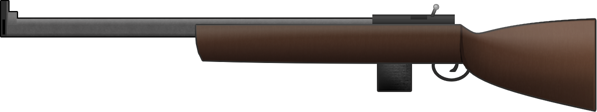
by FaultCheck
highres_rifle_b_and_s.png (80.78 KiB) Viewed 9508 times
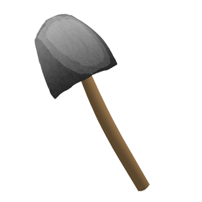
by FaultCheck
highres_spade_b_and_s.png (116.99 KiB) Viewed 9508 times
Re: My humble submission
Posted: Fri Jul 11, 2014 10:05 pm
by Mr.Torch
izzy wrote:Looks great!
Couple of requests:
1) Remove/smooth out the white scratchy edges of the explosion.
2) Make sure the image is scalable to 250x100 pixels.
3) Add these weapons:
theginjaninja09, I'm not sure what program you are using, but if you need help doing any of this just let me know. And I would love to get access to the .psd file (if you're using Photoshop) the .pdn file (if you're using Paint.net) or the .xcf file (if you're using Gimp), so I can mess around with it myself :).
Re: My humble submission
Posted: Sat Jul 12, 2014 5:32 am
by theginjaninja09
Ok everybody, I've read all your posts, and I
am going to make have made the edits ect :)
I made lots of little variations.
All in one imgur album.
Re: My humble submission
Posted: Sat Jul 12, 2014 11:00 am
by Astrocat

I think this is my favorite. Nice use of the explosion to fill in the blank space. Simple but nice.

This one looks good too, but the spade is a bit derpy looking.
Sorry FaultCheck